


Camay Deo
Add to Favorites
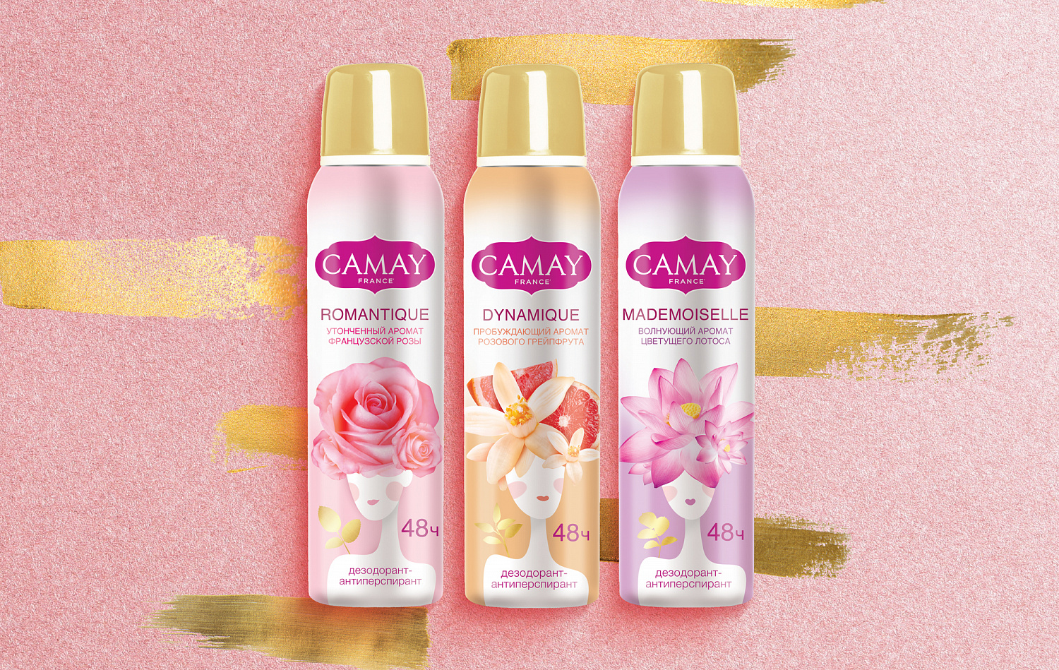
The agency faced a task to update the design of deodorant packaging, make the picture lighter and more delicate, avoid the dark colors associated with oriental codes, and emphasize French origin of the brand. The new design was supposed to attract a younger audience, but also not to scare away a loyal consumer.
The aroma came to the forefront of the new external image of the deodorant. It was metaphorically visualized as a hairstyle flower. The main characters are drawn without fine line detail , only common features. White thin shoulders, red lips and accent on “floral” hairstyle became the main design elements. The idea was split into three SKUs, each girl was depicted with a flower of her own fragrance. Everything is in light, powdery shades and a little gold to add premiality. Dark shades are in the past, giving place to a fresh chord. We designed three fragrances (rose, lotus and grapefruit) in three packaging formats.
The aroma came to the forefront of the new external image of the deodorant. It was metaphorically visualized as a hairstyle flower. The main characters are drawn without fine line detail , only common features. White thin shoulders, red lips and accent on “floral” hairstyle became the main design elements. The idea was split into three SKUs, each girl was depicted with a flower of her own fragrance. Everything is in light, powdery shades and a little gold to add premiality. Dark shades are in the past, giving place to a fresh chord. We designed three fragrances (rose, lotus and grapefruit) in three packaging formats.
Services rendered:
Label and packaging graphic design
Activity:
Self-Care & Sport
Cosmetics & Pharmacy
Client:
Unilever
End Date:
09/16/2019


