VEKA
Andrey Taranushich, Commercial Director of VEKA RUS: «The market is moving from just consumption — because it was necessary to change obsolete designs that did not meet the requirements — to, in essence, build a living space. We needed qualified help in reformatting communications with the consumer in order to convey more effectively the principles that the company has been adhering to for many years.»
VEKA is the backbone player of the category. There will be no manufacturer of the profile — there will be no workshops, dealers, partners. The company creates both a product and communications so other participants in the «window» market can also work in it. Based on such a large-scale influence on the category, it became clear that the previously used slogan «If windows, then VEKA» is more inappropriate: it worked mainly in the interests of window manufacturers and sellers, and for the audience in «low» price segments. Moreover, while creating the positioning, we basically moved away from the concept of a «window company»: first of all, VEKA is a group of strong managers and executive team. And also technologies (including «green») and innovations, logistics, education, competencies and marketing.
In the process, the need to rebuild brand architecture for the Russian market was felt. The case for the company is almost unique: all over the world VEKA products are manufactured under a single «information code plate»; a corporate brand also functions under it. Previously, sub-brands were not even considered as a method of achieving any strategic goals — neither on the global, nor in the local markets.
Farhad Kuchkarov, Depot Strategy Director: «The company has been perceived by consumers as Russian for many years. And therefore, one of our basic tasks was to strengthen the perception of the brand as global, international. In addition, this perception prevented the recruitment of target groups of architects, designers, advanced developers, and the main middle-segments of B2C audiences. And the lack of a brand platform led to the fact that each time the company had to relate about itself, creating a huge amount of non-system content that dissolved positioning more every year. The lack of a clear architecture did not allow to target fundamentally different audiences within the framework of communications and to be flexible in different channels.»
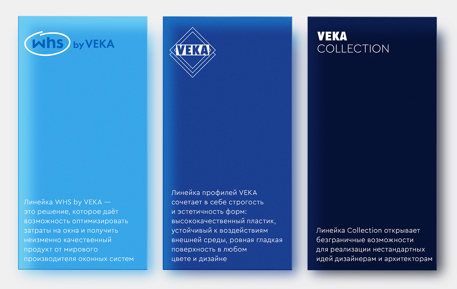
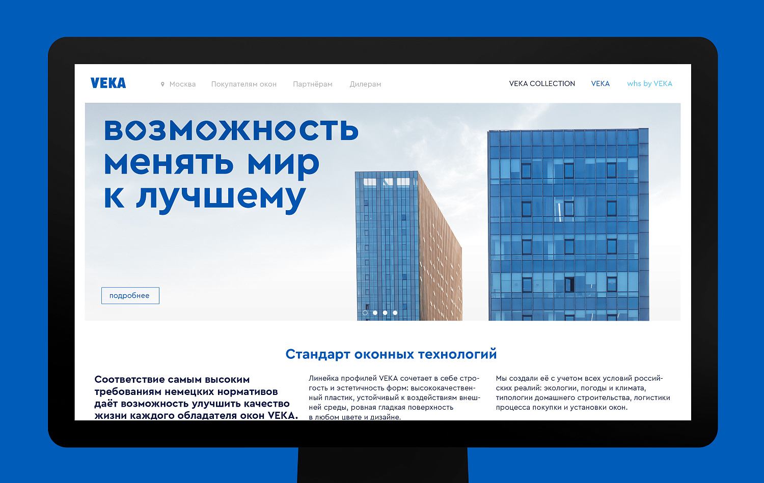
The updated architecture includes four brands: the corporate VEKA, the premium VEKA Collection, already familiar VEKA for the medium segment, and the «affordable» WHS by VEKA brand, designed to solve the basic problems of the mass consumer. The developed structure has already been presented in several countries where the brand is exists, officially approved by corporate group, and has received the approval of the global VEKA community.
Bonifatius Eichwald, Member of the Board of Directors of VEKA AG: «Marketing and marketing communications are actions that, of course, are related to the local characteristics of each market. We are talking about the concepts of brand identity and the brand. And the understanding of brand VEKA as a company with its own values includes certain requirements that apply to the design side and the design of communications. From this point of view, global regulations are binding on everyone. But, within the given framework, subsidiaries can individually shape their communication style.»

Bonifatius Eichwald, Member of the Board of Directors of VEKA AG: «Our main business competence is the production of window and door profiles. But we consider the product as a whole, not just one isolated part of it. The Russian market has all the opportunities for good and stable growth. Together with our partners, we want to develop various aspects of the window, its consumer properties. Here we are talking about the digital economy, the development of new technology for the profile surface, innovations, opportunities in the areas of energy conservation, protection, security, etc. We want our competencies to be able to influence the production of windows as an engineering system, with all its properties important to the consumer.»
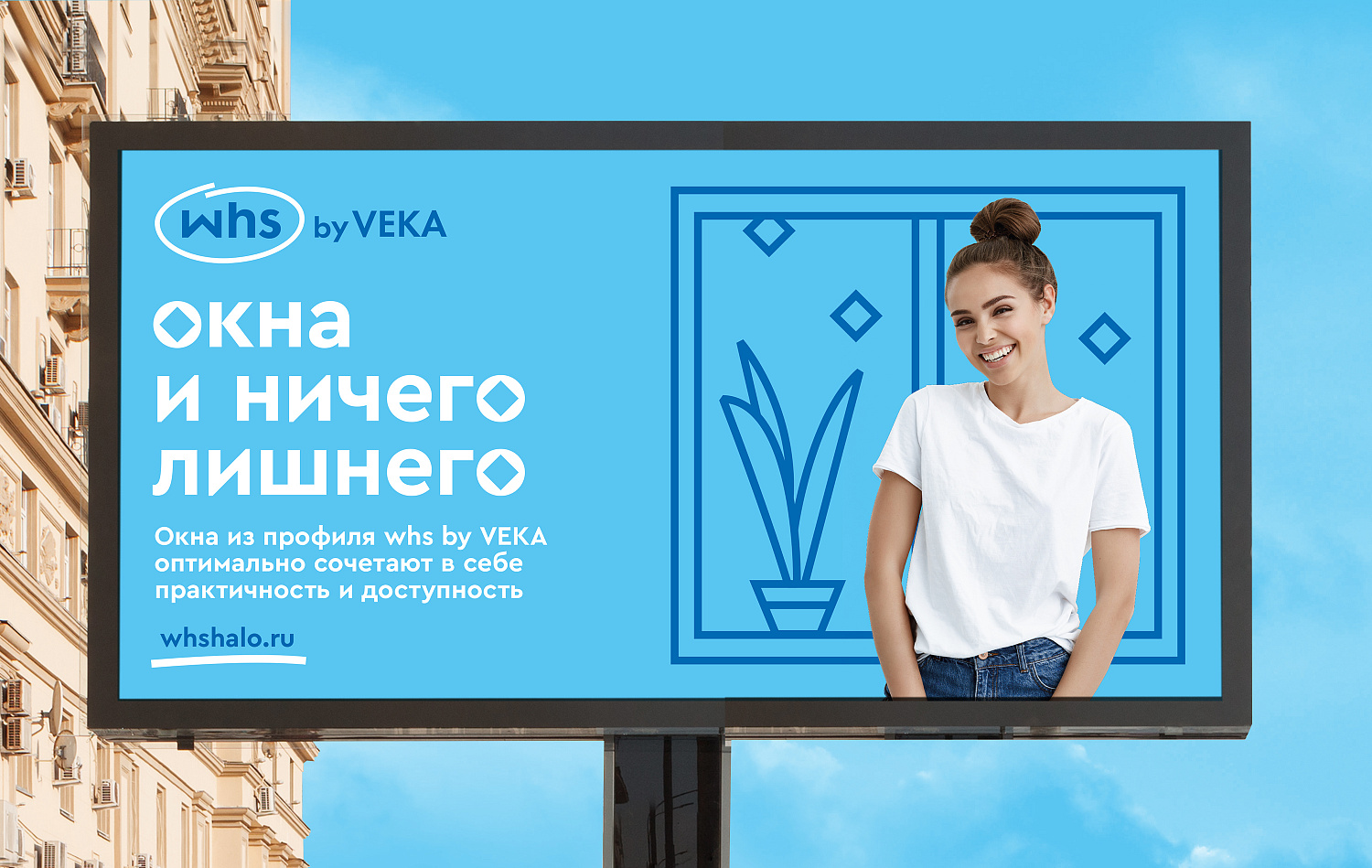

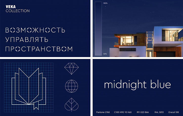
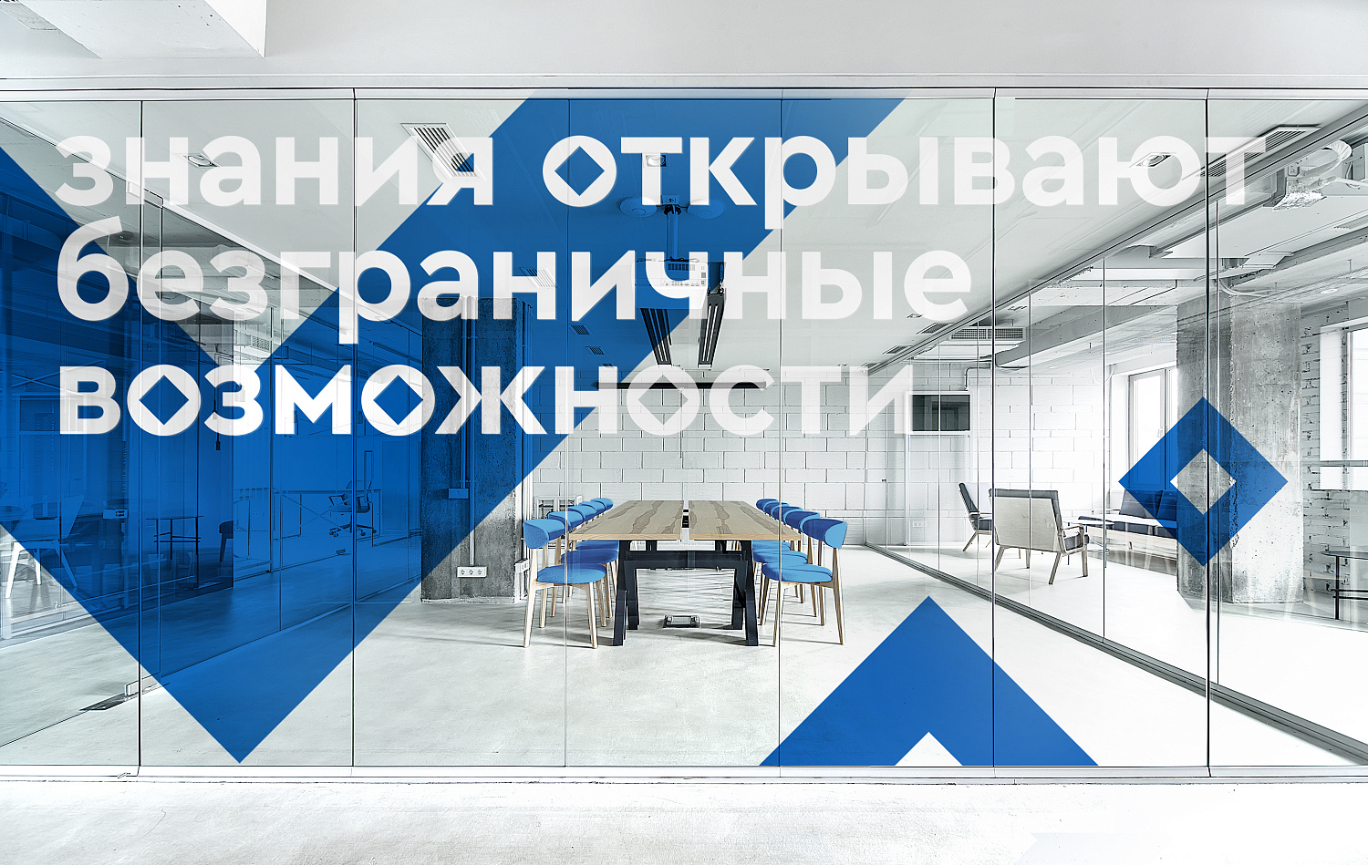
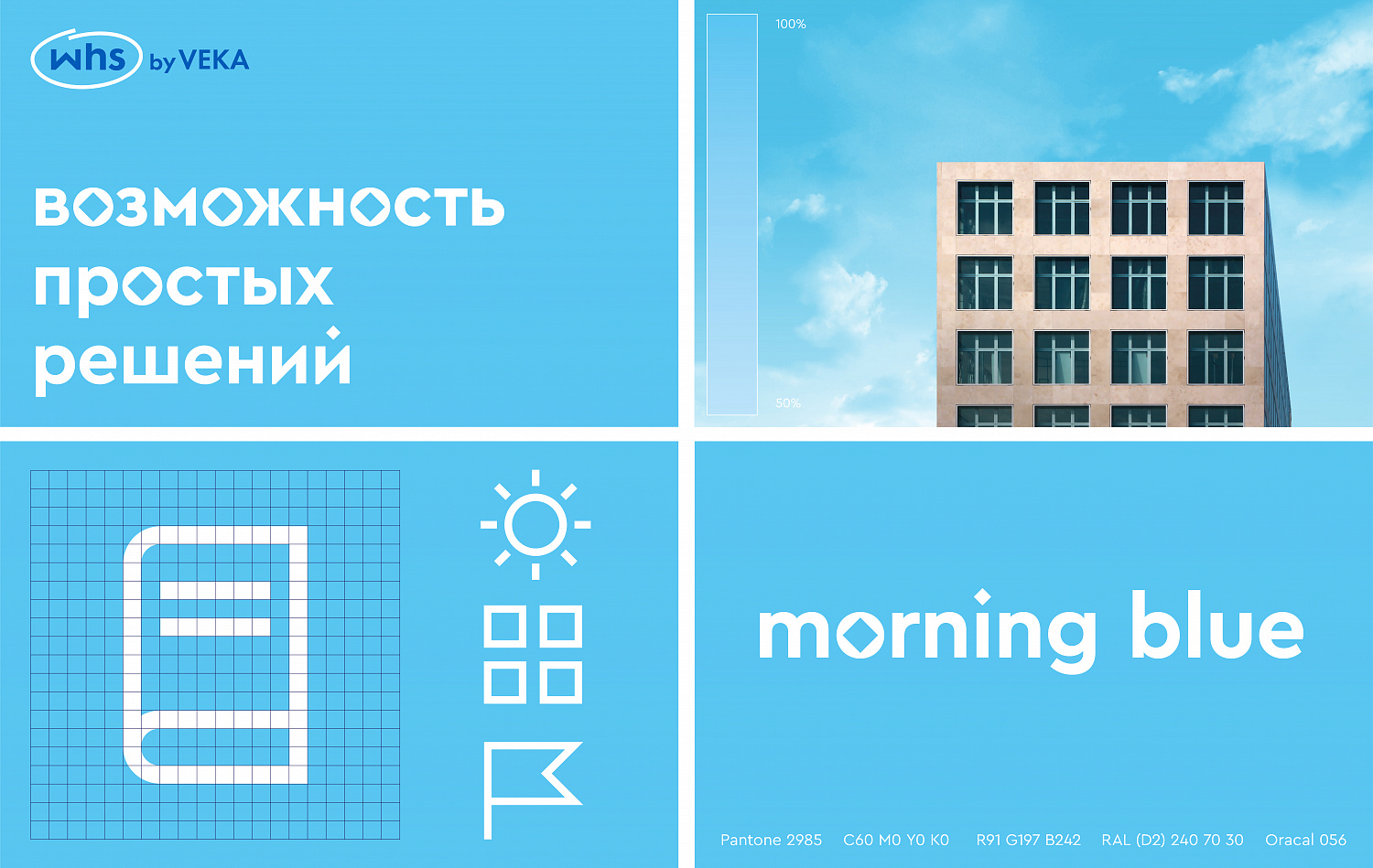
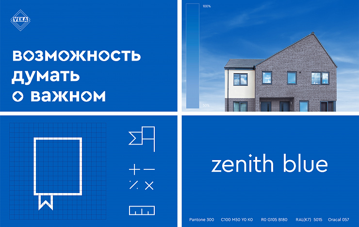
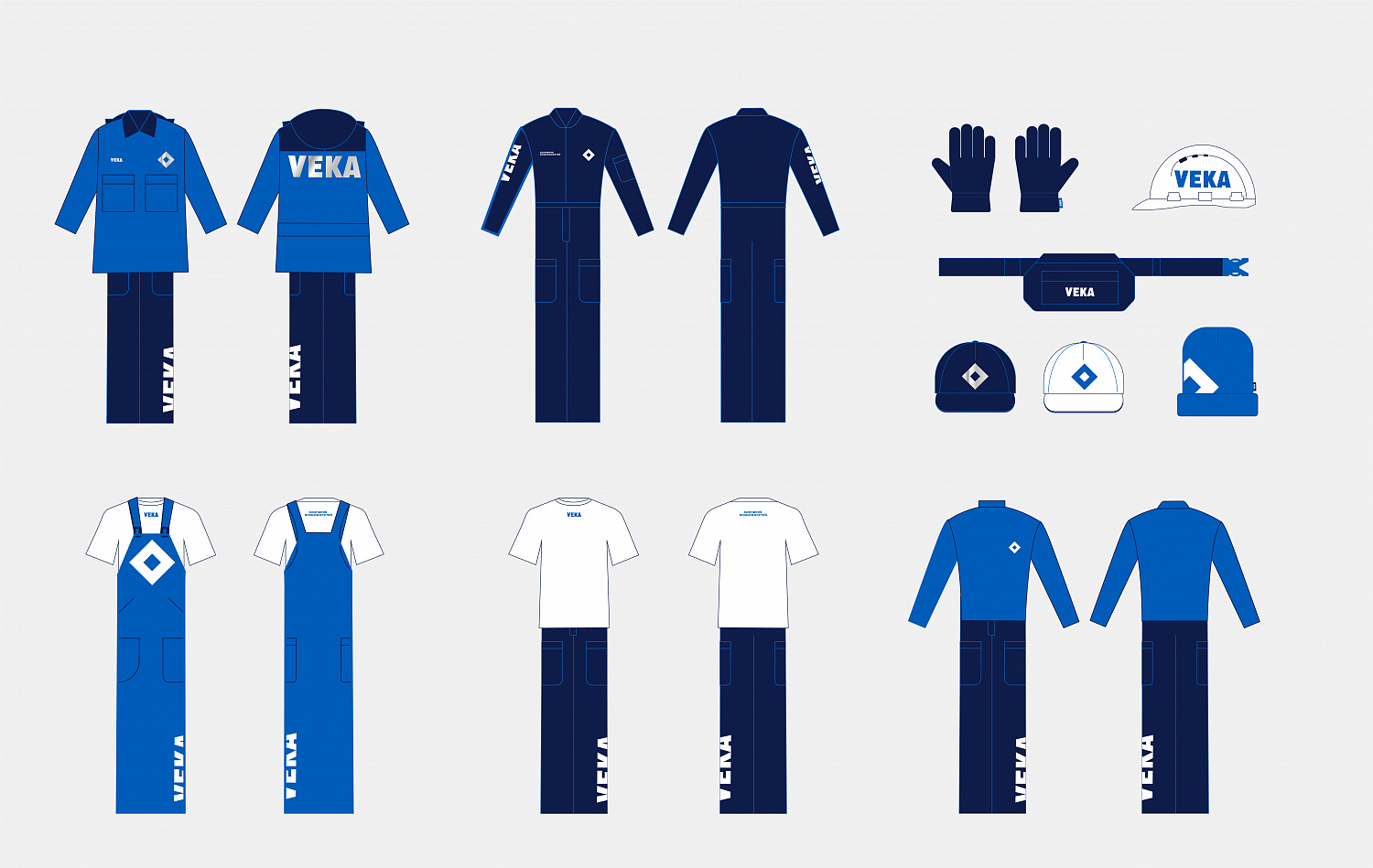
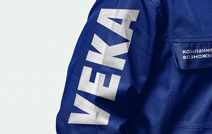
An important part of the photostyle of the whole architecture is what people see in the window most often — the sky. We deliberately selected the shade of the sky for the «mood» of each of the lines (and this is clearly stated in the guides): a light «morning» color for WHS, rich «daytime» for VEKA and a solid and darker «evening» shade for the premium line. Also, we had to work with the corporate font, so that text communications also accurately reflect their brand affiliation.
Raushan Sultanov, Art Director of Depot: «The task was ambitious: VEKA — a global brand, well-known, with a long history. The sophisticated architecture also added interest: it was necessary not only to preserve all the values and traditions of the global brand, but also not to forget about the correlation between the new sub-brands. The brand’s ambassador is the central, "historical" VEKA line. At the center of the visual solution here is a photo style with people who are doing their favorite things without being distracted by extraneous irritants. VEKA collection is a premium segment designed for architects and designers. And, accordingly, it has characteristic codes: dark colors, sophisticated stylistics of the graphic language. And WHS by VEKA, the "basic", affordable line — however, is produced with the same high German quality, which was also important to emphasize. Therefore, in the style of this brand, we used illustrative graphics, which emphasized the light and modern character of the brand and did not create any “local” references.»
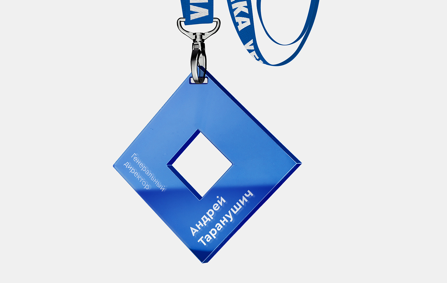
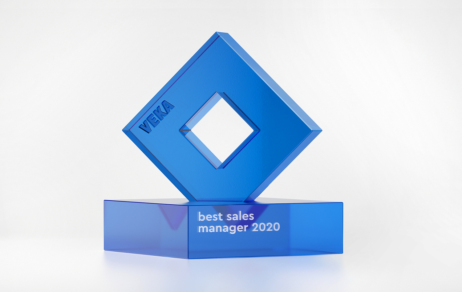
Tatyana Mikolaevskaya, Designer of Depot: «Initially, we selected the existing “typesetting” font. But they customized it: added “original” glyphs. The main element of the company's previous identity was a “rhombus” (yes, we know that it’s not him — but it is perceived that way), which we decided to save and use both in graphics and in font. It was this element that made the font recognizable and unique.»

Alyona Baklikova, Project Manager: «The style developed by Depot was highly appreciated not only by the Russian office of VEKA, but also by representatives of the parent company. It was a pleasure to see how the company was set to change. Our developments — style, communication strategy, creative promotion concept and showroom — began to be implemented in the shortest possible time. Unique, flexible and result-oriented client.»
However, the large-scale implementation of all the developments took a little longer. Even with the most active work on implementation, today we can talk about the implementation of only half of the jointly developed innovations. So the world will see a lot of interesting things invented in Depot in the very near future.