Citilink

Until recently, at the disposal of marketers there were only a logo, a corporate orange color, a font and an unsystematic set of style elements. Every new communication was visually different from the previous one: advertising materials were created according to the different principles, preventing the formation of a unified image of the company and increasing the brand recognition. In addition, the absence of corporate style constants and uniform layout rules increased the time required to develop each new advertising communication.The various points of delivery of goods in different regions were also drawn up every time from scratch — the designers «on the ground» were given complete freedom of action.

For the delivery points of the goods, Citilink Mini also needed to think over a universal solution for registration that would reflect the multi-category of the retailer, would work perfectly regardless of the format and size of the point and would be extremely simple and budgetary in implementation.


Tatyana Mikolaevskaya, Art Director of the project: «First of all, we upd ated the logo of Citilink. The sign has shifted to the right, which made the openness of the rounded rectangle more noticeable and increased its similarity with the letter «C», and the corporate unit with the name and descriptor increased — it had to be done, as in the previous version it was not always noticeable, and sometimes words in the descriptor were hardly read.»
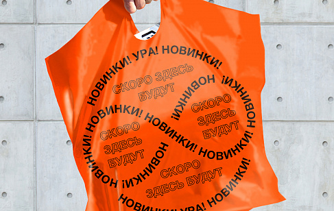
The style element, which united all the communications of Citilink, was a scalable frame with rounded corners, which appeared from the sign. It can host the most diverse content — from photo images to slogans. For each product category, pictograms related to the Citilink logo were developed.


The main corporate color — orange — was preserved in all communications. But at the same time for the ads of the «product-price» format there were additional colors — pink for the traditionally «female» categories of goods, gray for the goods addressed to the male audience, and green for the household goods.


Ksenia Tarasova, Project Manager of Depot: «To make it convenient, simple and, most importantly, time-consuming, correct reproduction of brand communications anywhere in Russia, we developed a simple rule of horizontal division of advertising models into two halves. The upper part is the brand field, the lower part is the product field.»


