KitKat Senses

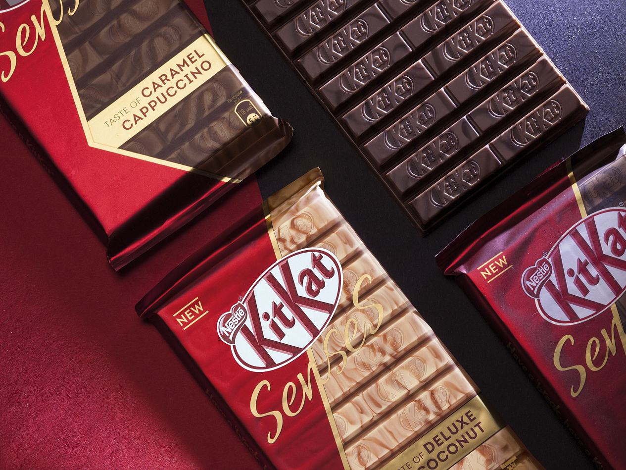
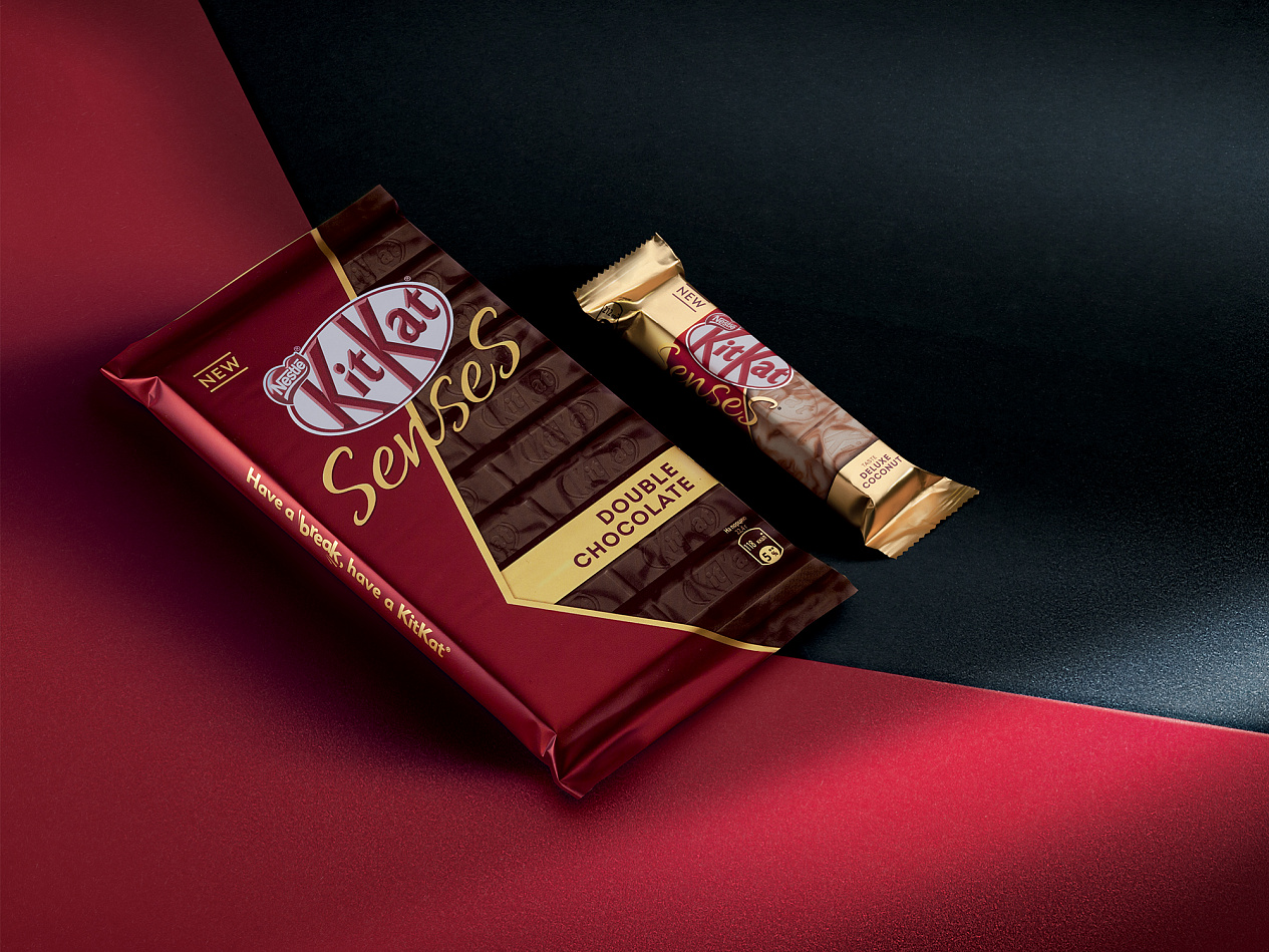
Chocolate KitKat Senses stands out: the new technology of simultaneous feeding of different types of chocolate has allowed to achieve complex patterns on the surface of the tile, which makes each KitKat Senses unique. The beauty of the resulting patterns has also laid down in the design of the package, in which a realistic image of the product is framed by a saturated red background, made in the form of a capital letter «K».


Evgeniya Struk, Depot art director: «During the development of the new KitKat Senses design, we faced a challenge: to emphasize all the advantages of the brand new product for KitKat, while maintaining the basic constants of the global brand identity. After choosing the main graphic direction, we focused on delicate selection of materials and colors. Snapshots of hundreds of product samples replaced each other until the «the one» was found. The search for red color also went beyond the pantone fan: we carried everything that could come under the definition of «suitable red» to the office. The choice of packaging material played a crucial role in achieving a brilliant result: we strived for a deep red color with noble brilliance, sparkling gold and a realistic snapshot of the product.»


Olga Shakhova KitKat brand manager: «We are very pleased with the cooperation with the Depot team and the final result. The new package received high appraisal on consumer tests and was perceived by consumers as premium. And, indeed, the product stands out favorably on the shelves of stores, keeping the brand recognizable and attracting attention to the novelty.»
The design was prepared for packing in 40 and 112 grams and three different flavors: white chocolate with coconut taste and milk chocolate with a taste of almonds and crispy wafers; white and milk chocolate with cappuccino taste with caramel and crispy waffles; milk and dark chocolate with a crispy waffle.


