Rockwool Scandic
Add to Favorites


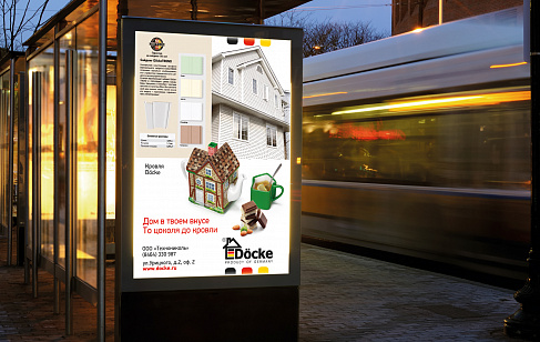
The requirements for the design of the packaging were that it should be clear, simple and include as much information as possible. It was important to strengthen the company’s image as a leading innovator, offering next-generation products to the market and highlighting the brand’s Scandinavian roots, the fact that it is environmentally friendly, and its premium quality. The design is inspired by the wooden Scandinavian cubes that were once a much-loved children’s game. They were the key motif in the design of the packaging and of the various advertising media.


Services rendered:
Visual identity
Creative idea and promotion concept
Brand book and retail book
Communication strategy
Brand audit
Label and packaging graphic design
Activity:
Household Goods & Building Materials
Client:
Rockwool International
End Date:
06/01/2012


