Rozhkov Dairy Farm

When you drink milk, you don't want to think of green fields and cows and you are tired of the "legends" about family farms and high-tech plants. You're fed up with logos made as big as possible and appetite appeals. But it's always a pleasure to turn the bottle over in your hands, if there is a story familiar to you.
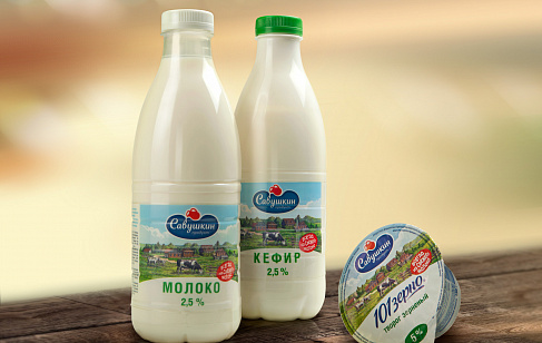
Rozhkov dairy farm is a family owned company. So the packaging could not look like any high-tech plant dairy product. At the same time we tried to avoid the traditional “farmers theme” which is often used by small Russian market players.
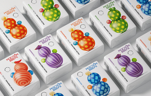
So we invented a unique visual language to tell stories. The language is based on color coding and the style of illustrations. And the stories are not typical for the dairy industry. They are personal, touching and come closer to people’s lives.
The blue-red color code nostalgically reminds of the soviet dairy products. Sometimes in the illustrations we use the familiar design elements of the old packaging. However the dairy is not the theme. And the illustrations are not really the packaging design. They are pieces of art made with tempera and a ballpoint pen without a common plot. The only thing that unites them except for the graphic style is the warm feeling of a story that everyone could think out personally.
And where’s the logo? Oh, it’s on the side with some technical information as it’s not the hero of our stories.


