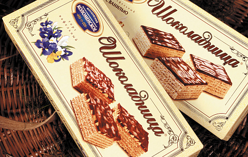
«Zolotaya Marka» chocolate plates

The agency's team has moved beyond the "standard" branding approach, in which the entire design system is built around packaging, focusing its attention on the chocolate itself. The designers completely immersed themselves in the creative process, because the project lay in the basis of pure art and art.

— We had an unusual task in front of us, which at some point even seemed impossible, - says Jane Struk, art director of Depot, about the project. — After all, we had to manually create unique chocolates, the shape and design of which, in the future, the machine will be able to repeat.

— Everything didn't work out right away, — Jane shares the subtleties of the work process. — We drew the design on the computer, then we tried to make a chocolate bar according to the created sketch. Then we sent the result to production — and it turned out that the equipment could not perform this or that element. It had to start all over again.
— It may seem to someone that creating a design for such a chocolate bar is nothing complicated, — complains Jane. — Just think: melt the chocolate, pour in nuts, crisps. Within a single plate, maybe it's simple. But when it comes to the industrial production of chocolate, which is made in a craft style, the possibility of replicating it — the design development process is much more complicated.

Of course, the design of the "Golden Brand" also conveys the uniqueness of the product design, without breaking out of the general visual style of the "Russia – a generous soul!" lines. The front side of the package shows an imitation of a transparent window in which the texture and elements of tile decoration are visible. In total, three "duets" of flavors with their own design were developed: "in caramel", "in milk" and "in strawberry".


